Business
Workflow building platform; a low code visual language to automate business processes between desired software tools in the midsize services industry.
Problem to solve
The new product being built needed information displayed and categorized in a way that made sense to both our highly technical developer persona and our more everyday get-in-and-get-out persona.
Card Sort
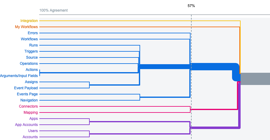
While conducting competitor analysis’ what I was really curious about was all of the elements and components to this platform we were building, and specifically how each of our personas would categorize the elements.
Creating a card sort seemed like a great way to get started with this. The card sort was a mixed type test, meaning there were pre-labeled categories the users could use, but they also had the option to create their own. After some internal testing, the results were not as clear as I had hoped. At around 57% there started to form some agreement upon categorization. To my surprise though our two different targeted personas tested, didn’t show any obvious differentiation in how they sorted their cards.
IA Typology Research
While the card sort data was being collected I decided to try and find any sort of information architecture typology patterns I could from the competitors in this space.
While I couldn’t find any obvious patterns to be consistent across the space I did find some general buckets that seemed to also map back to the card sorting results.
Treejack Testing
With nothing really super conclusive from the card sort or competitor analysis I wanted to move ahead and start user testing the information architecture as it currently was in the legacy platform.
Here I decided to test three different areas
- adding a new workflow (most common action)
- updating an app account (differing internal ideas on where this should be)
- error alerts (most unsure about this)
Results & Conclusion
I had a lot of fun with this test. The image on the right shows some really great learnings. The second task we asked the user to navigate to the first time we got mixed results on and after interviewing the candidates, the wording of the question seemed to be the culprit.
After we updated the wording to better reflect what we were asking the user to find, we got a very direct fail. Which to me is the most exciting because this means the users are very directly all expecting it to be in a different place. By updating the location to be where the users all went, then on the last round of testing we got 100% direct success rate.
Likewise but less drastic we were able to improve the success rates of the other tasks as well over the course of the 3 rounds of testing. Leaving us with a great starting point combined with the rest of the research and previous card sort.


